本文最后更新于:2025年4月30日 下午
Echarts 有Python 版,叫做 pyecharts,使用起来十分方便,本文记录基本使用方法。
简介
Echarts 是一个由百度开源的数据可视化,凭借着良好的交互性,精巧的图表设计,得到了众多开发者的认可。而 Python 是一门富有表达力的语言,很适合用于数据处理。当数据分析遇上数据可视化时,pyecharts 诞生了。
特性
- 简洁的 API 设计,使用如丝滑般流畅,支持链式调用
- 囊括了 30+ 种常见图表,应有尽有
- 支持主流 Notebook 环境,Jupyter Notebook 和 JupyterLab
- 可轻松集成至 Flask,Django 等主流 Web 框架
- 高度灵活的配置项,可轻松搭配出精美的图表
- 详细的文档和示例,帮助开发者更快的上手项目
- 多达 400+ 地图文件以及原生的百度地图,为地理数据可视化提供强有力的支持
版本
pyecharts 分为 v0.5.X 和 v1 两个大版本,v0.5.X 和 v1 间不兼容,v1 是一个全新的版本。
安装配置
新版 pyecharts 支持 python 3.6+ 版本,安装好 Python 后直接 pip 安装就行:
1 | |
绘图配置项
全局配置项
全局配置项可通过 set_global_opts 方法设置

AnimationOpts:Echarts 画图动画配置项
class pyecharts.options.Animation
1 | |
AriaLabelOpts:无障碍标签配置项
class pyecharts.options.AriaLabelOpts
1 | |
AriaDecalOpts:无障碍贴花配置项
class pyecharts.options.AriaDecalOpts
1 | |
InitOpts:初始化配置项
class pyecharts.options.InitOpts
1 | |
ToolBoxFeatureSaveAsImagesOpts:工具箱保存图片配置项
class pyecharts.options.ToolBoxFeatureSaveAsImagesOpts
1 | |
ToolBoxFeatureRestoreOpts:工具箱还原配置项
class pyecharts.options.ToolBoxFeatureRestoreOpts
1 | |
ToolBoxFeatureDataViewOpts:工具箱数据视图工具
class pyecharts.options.ToolBoxFeatureDataViewOpts
1 | |
ToolBoxFeatureDataZoomOpts:工具箱区域缩放配置项
class pyecharts.options.ToolBoxFeatureDataZoomOpts
1 | |
ToolBoxFeatureMagicTypeOpts:工具箱动态类型切换配置项
class pyecharts.options.ToolBoxFeatureMagicTypeOpts
1 | |
ToolBoxFeatureBrushOpts:工具箱选框组件配置项
class pyecharts.options.ToolBoxFeatureBrushOpts
1 | |
ToolBoxFeatureOpts:工具箱工具配置项
class pyecharts.options.ToolBoxFeatureOpts
1 | |
ToolboxOpts:工具箱配置项
class pyecharts.options.ToolboxOpts
1 | |
BrushOpts:区域选择组件配置项
class pyecharts.options.BrushOpts
1 | |
TitleOpts:标题配置项
class pyecharts.options.TitleOpts
1 | |
DataZoomOpts:区域缩放配置项
class pyecharts.options.DataZoomOpts
1 | |
LegendOpts:图例配置项
class pyecharts.options.LegendOpts
1 | |
VisualMapOpts:视觉映射配置项
class pyecharts.options.VisualMapOpts
1 | |
TooltipOpts:提示框配置项
class pyecharts.options.TooltipOpts
1 | |
AxisLineOpts: 坐标轴轴线配置项
class pyecharts.option.AxisLineOpts
1 | |
AxisTickOpts: 坐标轴刻度配置项
class pyecharts.option.AxisTickOpts
1 | |
AxisPointerOpts: 坐标轴指示器配置项
class pyecharts.option.AxisPointerOpts
1 | |
AxisOpts:坐标轴配置项
class pyecharts.options.AxisOpts
1 | |
SingleAxisOpts:单轴配置项
class pyecharts.SingleAxisOpts
1 | |
GraphicGroup:原生图形元素组件
class pyecharts.GraphicGroup
1 | |
GraphicItem:原生图形配置项
class pyecharts.GraphicItem
1 | |
GraphicBasicStyleOpts:原生图形基础配置项
class pyecharts.GraphicBasicStyleOpts
1 | |
GraphicShapeOpts:原生图形形状配置项
class pyecharts.GraphicShapeOpts
1 | |
GraphicImage:原生图形图片配置项
class pyecharts.GraphicImage
1 | |
GraphicImageStyleOpts:原生图形图片样式配置项
class pyecharts.GraphicImageStyleOpts
1 | |
GraphicText:原生图形文本配置项
class pyecharts.GraphicText
1 | |
GraphicTextStyleOpts:原生图形文本样式配置项
class pyecharts.GraphicTextStyleOpts
1 | |
GraphicRect:原生图形矩形配置项
class pyecharts.GraphicRect
1 | |
PolarOpts:极坐标系配置
class pyecharts.PolarOpts
1 | |
DatasetTransformOpts:数据集转换配置项
class pyecharts.options.DatasetTransformOpts
1 | |
系列配置项
ItemStyleOpts:图元样式配置项
class pyecharts.options.ItemStyleOpts
1 | |
TextStyleOpts:文字样式配置项
class pyecharts.options.TextStyleOpts
1 | |
LabelOpts:标签配置项
class pyecharts.options.LabelOpts
1 | |
LineStyleOpts:线样式配置项
class pyecharts.options.LineStyleOpts
1 | |
Lines3DEffectOpts: 3D线样式配置项
class pyecharts.options.Lines3DEffectOpts
1 | |
SplitLineOpts:分割线配置项
class pyecharts.options.SplitLineOpts
1 | |
MarkPointItem:标记点数据项
class pyecharts.options.MarkPointItem
1 | |
MarkPointOpts:标记点配置项
class pyecharts.options.MarkPointOpts
1 | |
MarkLineItem:标记线数据项
class pyecharts.options.MarkLineItem
1 | |
MarkLineOpts:标记线配置项
class pyecharts.options.MarkLineOpts
1 | |
MarkAreaItem: 标记区域数据项
class pyecharts.options.MarkAreaItem
1 | |
MarkAreaOpts: 标记区域配置项
class pyecharts.options.MarkAreaOpts
1 | |
EffectOpts:涟漪特效配置项
class pyecharts.EffectOpts.EffectOpts
1 | |
AreaStyleOpts:区域填充样式配置项
class pyecharts.options.AreaStyleOpts
1 | |
SplitAreaOpts:分隔区域配置项
class pyecharts.options.SplitAreaOpts
1 | |
MinorTickOpts:次级刻度配置项
class pyecharts.options.MinorTickOpts
1 | |
MinorSplitLineOpts:次级分割线配置项
class pyecharts.options.MinorSplitLineOpts
1 | |
GraphGLForceAtlas2Opts: GraphGL Atlas2 算法配置项
class pyecharts.options.GraphGLForceAtlas2Opts
1 | |
基本使用
Pyecharts 使用起来有一定"套路"
单图表生成
-
引入相关包,根据自己需要的配置、图表类型引入对应的包
1
from pyecharts.charts import Bar -
创建对应图表的对象
1
bar = Bar() -
向图表对象添加数据
1
2bar.add_xaxis(["衬衫", "羊毛衫", "雪纺衫", "裤子", "高跟鞋", "袜子"])
bar.add_yaxis("商家A", [5, 20, 36, 10, 75, 90]) -
渲染 html 文件
1
bar.render() -
生成
render.html,示例效果: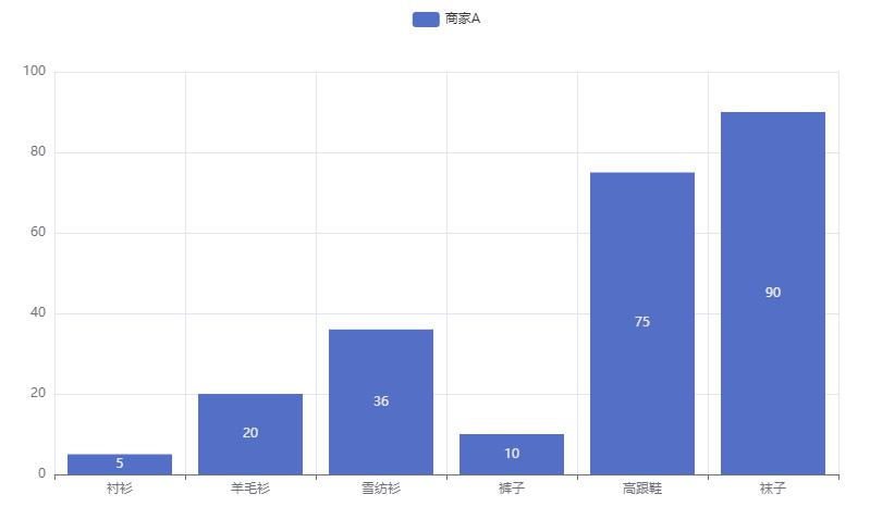
多图表生成
-
当需要多个图表出现在一个 html 文件中时需要使用
Page1
from pyecharts.charts import Bar, Page -
创建 Page 对象
1
page = Page() -
创建多个图表对象
1
2
3
4
5
6
7
8
9bar1 = Bar()
bar1.add_xaxis(["衬衫", "羊毛衫", "雪纺衫", "裤子", "高跟鞋", "袜子"])
bar1.add_yaxis("商家A", [5, 20, 36, 10, 75, 90])
# render 会生成本地 HTML 文件,默认会在当前目录生成 render.html 文件
# 也可以传入路径参数,如 bar.render("mycharts.html")
bar2 = Bar()
bar2.add_xaxis(["衬衫", "羊毛衫", "雪纺衫", "裤子", "高跟鞋", "袜子"])
bar2.add_yaxis("商家B", [5, 20, 36, 10, 75, 90][::-1]) -
将需要整合的图表对象添加到 Page 对象中
1
2page.add(bar1)
page.add(bar2) -
渲染 Page 对象
1
page.render() -
生成
render.html,示例效果: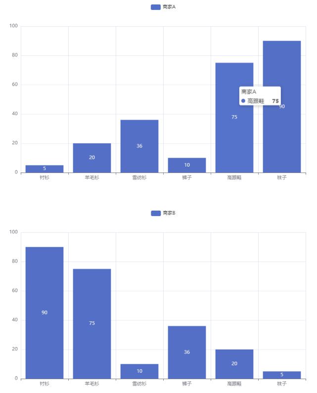
图表示例
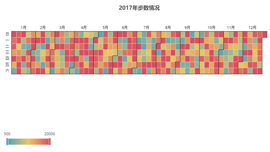
Calendar:日历图
- 示例代码:
1 | |
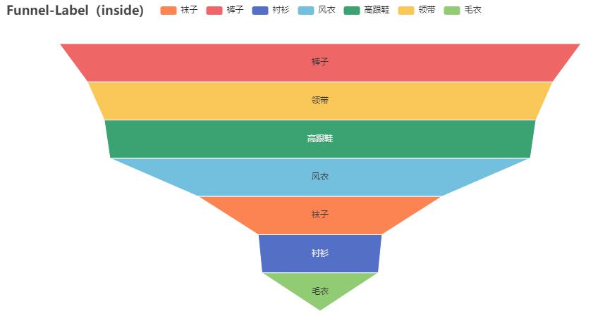
Funnel:漏斗图
- 示例代码:
1 | |
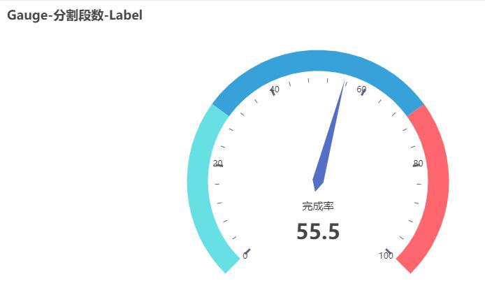
Gauge:仪表盘
- 示例代码:
1 | |
Graph:关系图
1 | |

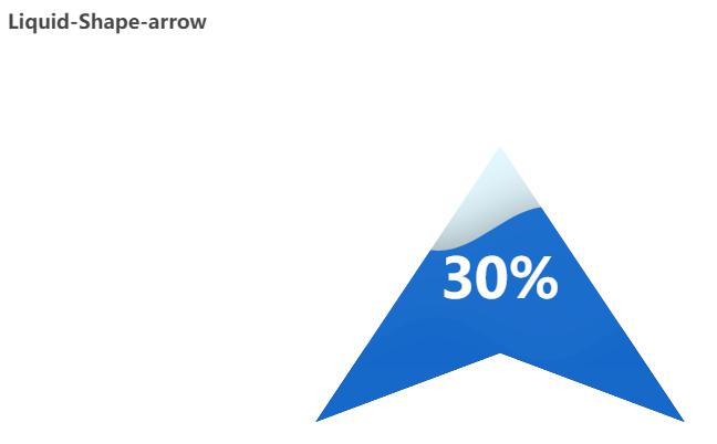
Liquid:水球图
- 示例代码:
1 | |
Parallel:平行坐标系
- 示例代码:
1 | |

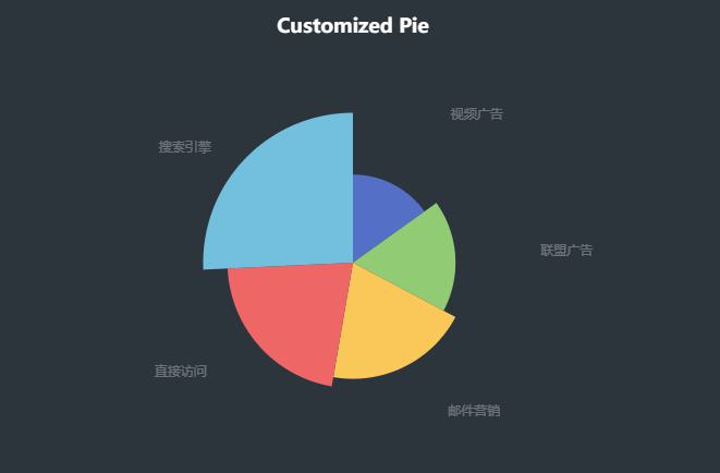
Pie:饼图
- 示例代码:
1 | |
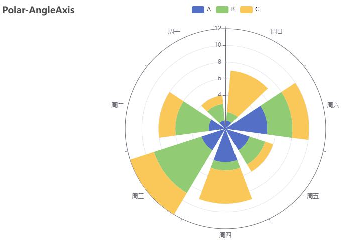
Polar:极坐标系
- 示例代码:
1 | |
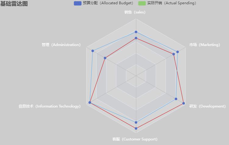
Radar:雷达图
- 示例代码:
1 | |
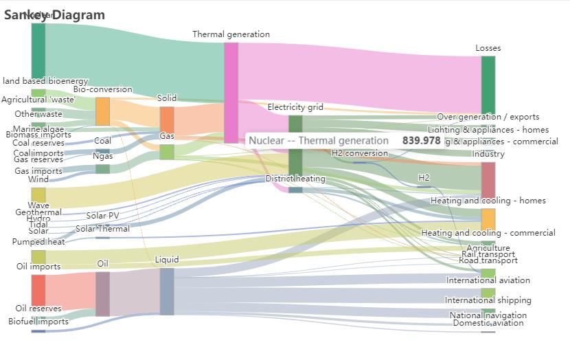
Sankey:桑基图
- 示例代码:
1 | |
Sunburst:旭日图
- 示例代码:
1 | |

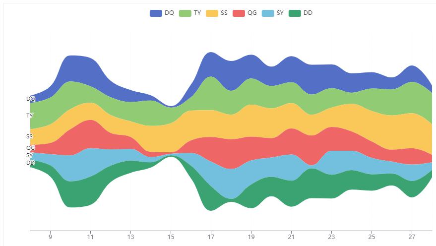
ThemeRiver:主题河流图
- 示例代码:
1 | |
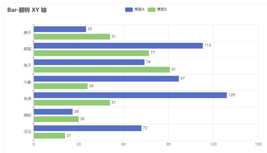
Bar:柱状图/条形图
重叠柱状图
柱子左右并列,适合对比不同系列的值。
- 示例代码:
1 | |
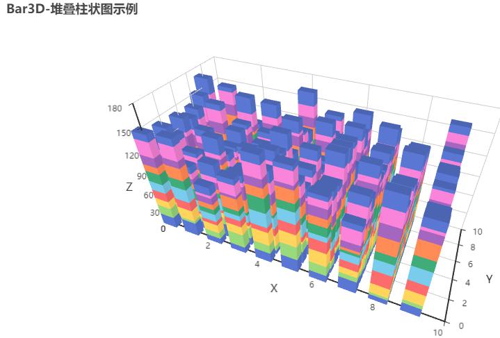
堆叠柱状图
柱子上下堆叠,适合展示总量。
- 示例代码:
1 | |

Boxplot:箱形图
- 示例代码:
1 | |

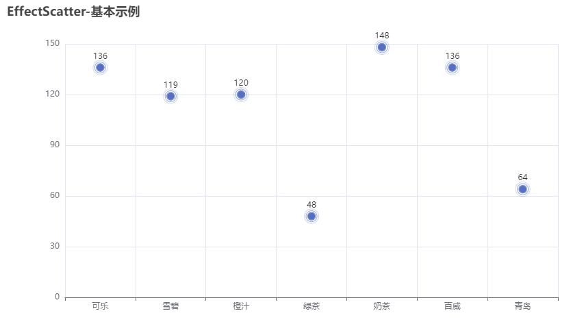
EffectScatter:涟漪特效散点图
- 示例代码:
1 | |
- 示例代码:
1 | |

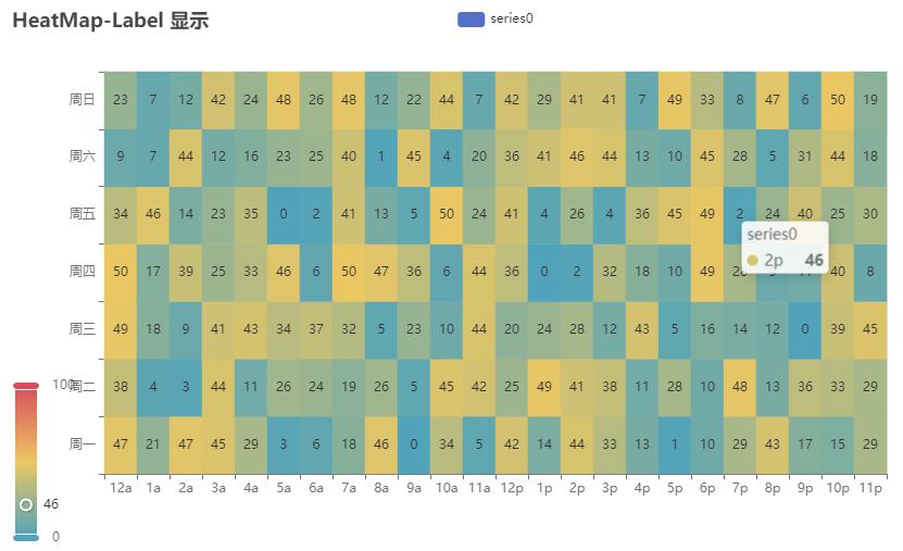
HeatMap:热力图
- 示例代码:
1 | |
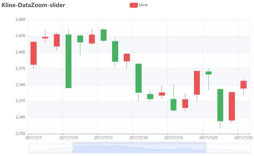
Kline/Candlestick:K线图
- 示例代码:
1 | |
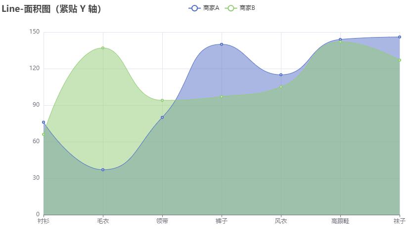
Line:折线/面积图
- 示例代码:
1 | |
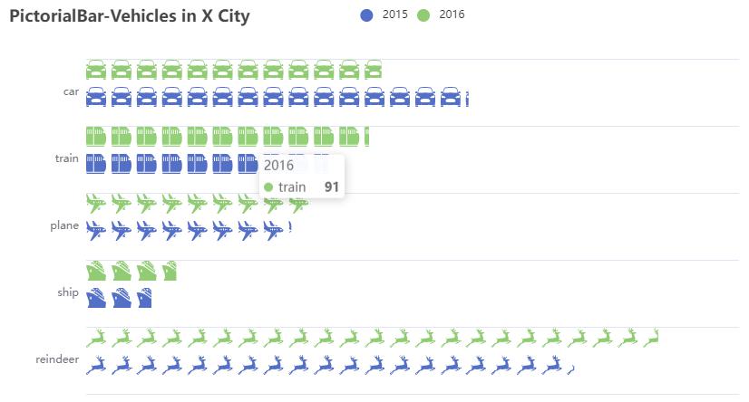
PictorialBar:象形柱状图
- 示例代码:
1 | |
Scatter:散点图
- 示例代码:
1 | |

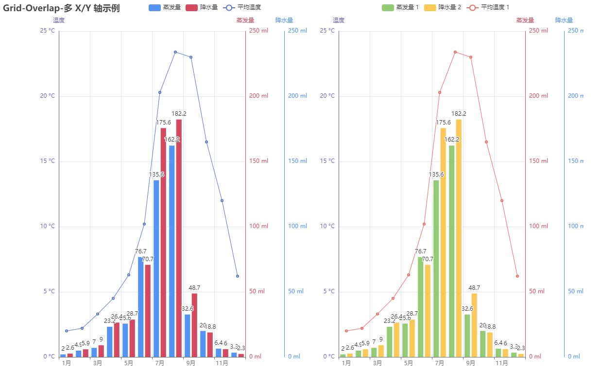
Overlap:层叠多图
- 示例代码:
1 | |

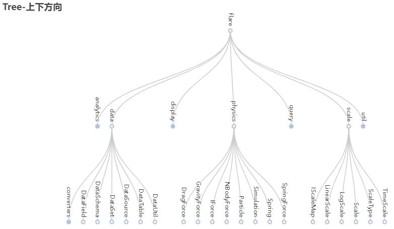
Tree:树图
- 示例代码:
1 | |
TreeMap:矩形树图
- 示例代码:
1 | |

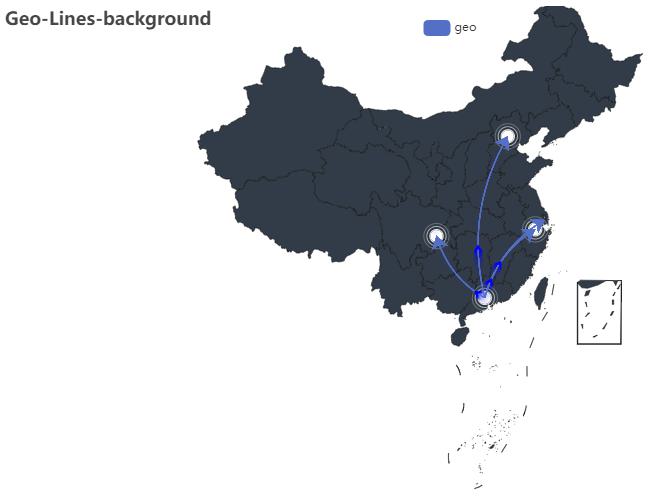
Geo:地理坐标系
- 示例代码:
1 | |
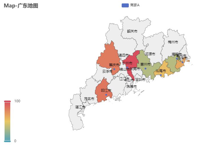
Map:地图
- 示例代码:
1 | |
BMap:百度地图
- 示例代码:
1 | |

Bar3D:3D柱状图
- 示例代码:
1 | |
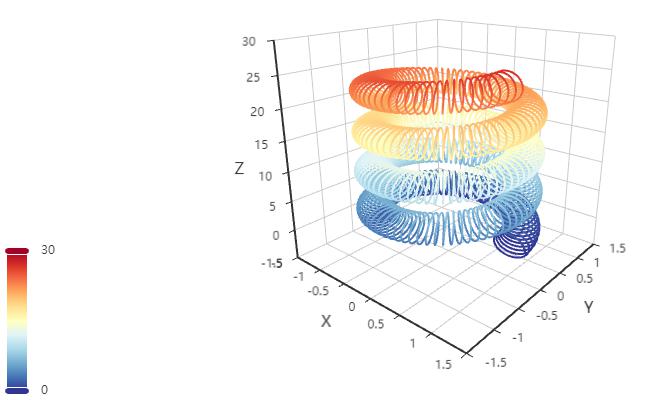
Line3D:3D折线图
- 示例代码:
1 | |
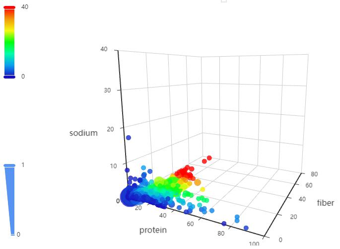
Scatter3D:3D散点图
- 示例代码:
1 | |
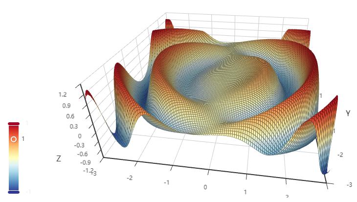
Surface3D:3D曲面图
- 示例代码:
1 | |
Map3D - 三维地图
- 示例代码:
1 | |

- 示例代码:
1 | |

Grid:并行多图
- 示例代码:
1 | |
Page:顺序多图
- 示例代码:
1 | |

Tab:选项卡多图
- 示例代码:
1 | |

Timeline:时间线轮播多图
- 示例代码:
1 | |
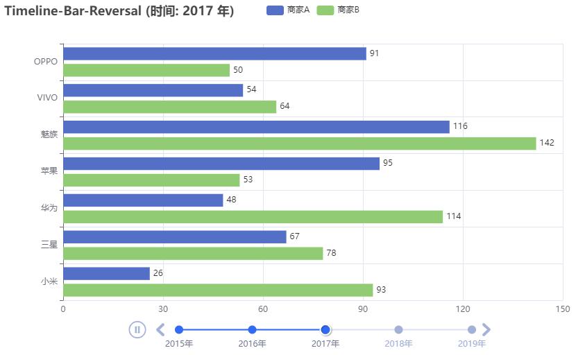
Table:表格
- 示例代码:
1 | |
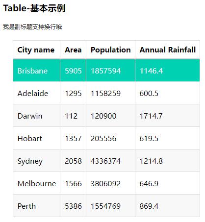
Image:图像
- 示例代码:
1 | |

参考资料
文章链接:
https://www.zywvvd.com/notes/coding/python/pyecharts/pyecharts/
“觉得不错的话,给点打赏吧 ୧(๑•̀⌄•́๑)૭”

微信支付

支付宝支付